How to adjust photo colors on Mac
To adjust photo colors on Mac, open the image in Montane and choose Adjust Color. Make small changes to light and color, compare with Show Original, and click Apply when the result looks right. Use Save As to keep the original photo available.
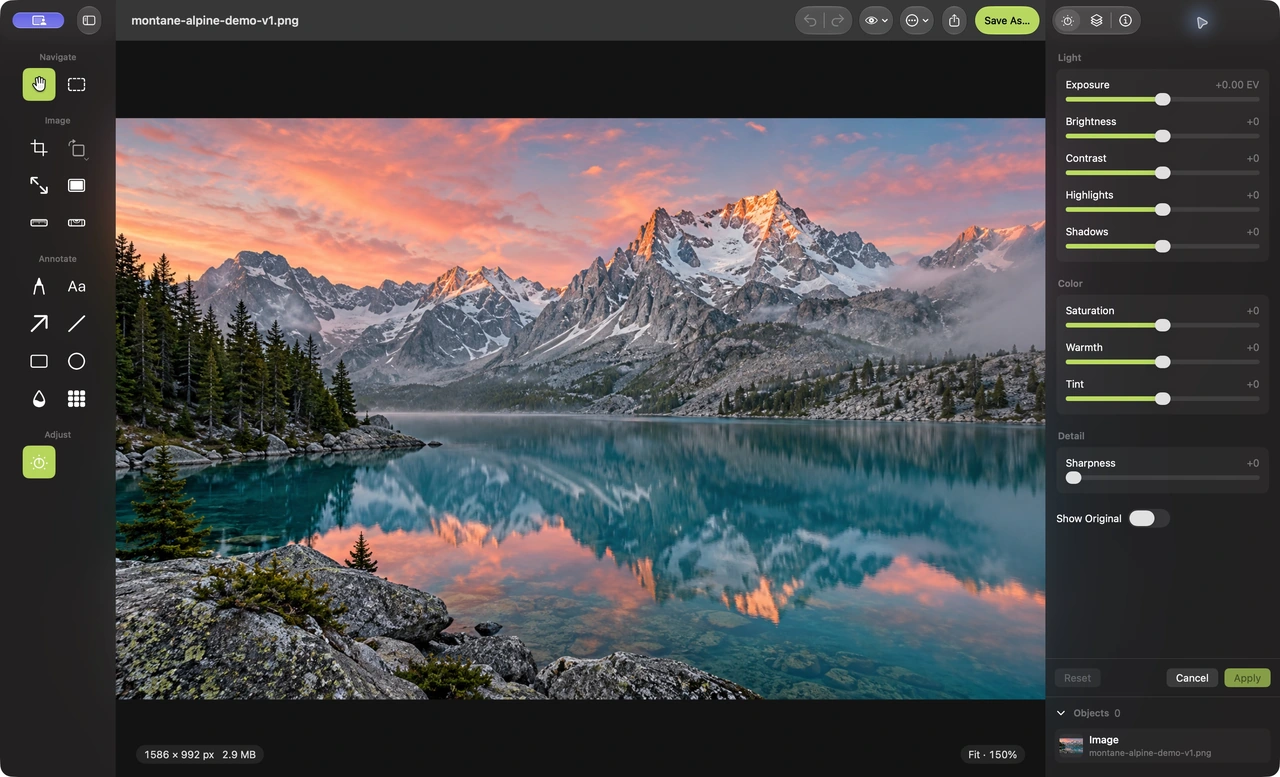
This guide uses Montane’s free Mac image editor on macOS 14 or later. Its adjustment panel includes exposure, brightness, contrast, highlights, shadows, saturation, warmth, tint, and sharpness. These are practical controls for everyday photos, with a live preview of the current draft.
Start with a particular problem
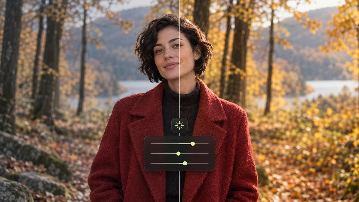
Decide what needs improvement before moving every slider. Is the image too dark? Does an indoor photo look too orange? Are the shadows hiding a useful detail? A specific goal makes it easier to judge whether the changes help.
Consider the light in the scene. A sunset naturally looks warm, and a shaded landscape may feel cool. Correcting every image toward the same neutral appearance can remove the atmosphere that made it interesting. Aim for a result that suits the subject and use.
Choose the framing first when possible. A large bright area that you intend to crop away can affect how you judge the overall photo. Use the crop guide to settle the composition, then review the light and color of the kept area.
Adjust a photo in Montane
- Open the source photo. Choose File → Open. Use a view that shows the whole image, then inspect important detail at a closer scale when needed.
- Open Adjust Color. Click Adjust Color in the left tool rail or choose the adjustment section of the inspector.
- Work on overall light. Adjust Exposure or Brightness gently. Check that the subject becomes clearer without making the image feel washed out.
- Review highlights and shadows. Use Highlights for brighter areas and Shadows for darker ones. Compare faces, clouds, foliage, or other relevant features as you work.
- Balance warmth and tint. Use Warmth to shift the image’s cool or warm appearance and Tint to address a green or magenta cast. Make small changes and compare frequently.
- Refine saturation and contrast. Add or reduce Saturation according to the subject. Use Contrast carefully so the image keeps useful detail.
- Compare and apply. Use Show Original to compare the draft with its starting image. If the change helps, click Apply and save a new output copy.
Use small changes rather than every control
An indoor portrait with an orange cast may mainly need a slight warmth adjustment. A shaded product photo may need a modest exposure change. Neither necessarily needs stronger saturation, more contrast, and extra sharpness as well.
Pause after each change and look at the subject. Skin can become unnaturally orange when saturation rises too far. Bright snow or clouds can lose subtle texture when the light is pushed too strongly. Opening shadows too aggressively can make an image look flat or reveal noise.
The sharpness control can make edges look more distinct, but it does not recover a missed focus or invent lost detail. Zoom in to check for harsh outlines or halos, then return to the intended display size to decide whether the change is useful.
Know when the draft becomes part of the image
Slider changes preview live before you apply them. Reset returns the draft controls to their starting values, and Cancel abandons that draft. Apply commits the adjustment to the base image as one undo step.
You can undo the applied change while the session is open. A later adjustment starts from the already committed pixels, so the panel is not a persistent stack of separate adjustment layers. Use a saved original when you want a fresh starting point after closing the session.
Annotations and other placed objects remain editable in the open document. Applying a color adjustment does not turn the session into a reusable project format. Standard exported images reopen as a flattened result.
Check the export as well as the preview
After you like the edit, choose an appropriate format and inspect the saved copy. A compressed export can soften details independently of the color changes. The JPEG file-size guide explains the quality and byte-count tradeoff; the WebP guide covers a common web output option.
Screens and receiving applications can display an image differently. Review it in the destination when the appearance is important, and avoid promising that one adjustment setting will look identical on every device.
Common questions
Does this guide cover RAW development or AI enhancement?
It covers Montane’s available light and color adjustments for supported images. It does not describe a RAW development workflow, automatic scene correction, or AI enhancement.
Why does Show Original look different after applying an earlier edit?
The current draft compares against its starting base image. After an earlier adjustment has been applied, that committed result becomes the basis for the next draft. Keep the original file for comparisons across editing sessions.
Should I always increase saturation?
No. Some images benefit from reducing it, and others need no saturation change. Choose according to the subject, the scene, and the intended appearance.
Find more about Montane’s native Mac editor or browse all guides.